


How can we help you?
Most popular posts
Sarbacane Contacts: how to feed a contact ...
Introduction to Sarbacane Campaigns
How to Manage My Domain Names with ...
SPF, DKIM, DMARC, what is authentication for ...
Sarbacane Campaigns: Creating My First Email Campaign
Categories
Get started
Discover all the information you need to understand all the features and services of Sarbacane.

Your account
Find out how to manage the settings, licenses, sharing and user management of your Sarbacane account.

Email campaigns
Discover how to create an effective, high-impact email campaign with Sarbacane Campaigns
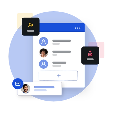
Contact management
Manage your contact and unsubscribe lists with Sarbacane Suite
SMS marketing
Send your SMS campaigns in just a few clicks with Sarbacane Campaigns
Automated campaigns
Create email and SMS campaign scenarios and trigger them automatically
Forms
Create easy-to-integrate forms. Feed your lists, send invitations or surveys

Landing pages
Create your own responsive design web pages and improve the ROI of your marketing actions with Sarbacane Pages

Licenses, Payment, and Billing
Everything you need to know about licenses, payment terms, and billing for Sarbacane
Template creation / Graphic Design
Discover how to manage your graphic creations as well as the creation of your models.
Data Protection
Find everything you need to know about GDPR and the commitments made by Sarbacane regarding data protection and security.
Deliverability and domain names
Discover how to optimize the arrival of your email campaigns in your contacts inbox.
Email prospecting
Create sales email scenarios and conquer new customers with Sarbacane Engage
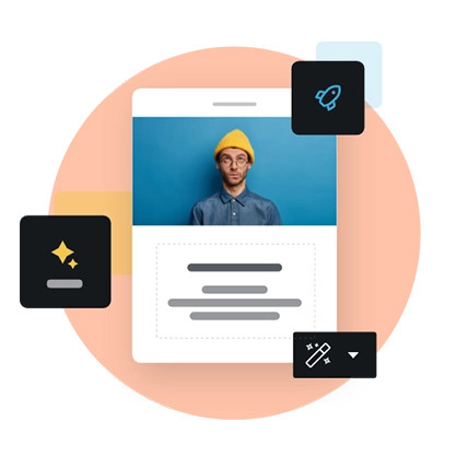
Artificial Intelligence
Make the most of features that enable you to save time and increase creativity effortlessly.
Live chat & Chatbot
With Sarbacane Chat, set up a chat bubble and interact in real-time with your visitors.
Connectors
Link your external applications and automate your actions with Sarbacane connectors.